


Upon joining, I started with some discovery activities to gain a basic understanding of the team’s vision. Questions in mind: What we already have/know? What our competitors are doing? What is our goal?

I established design principles to help guide my design decisions going forward.
Long term:
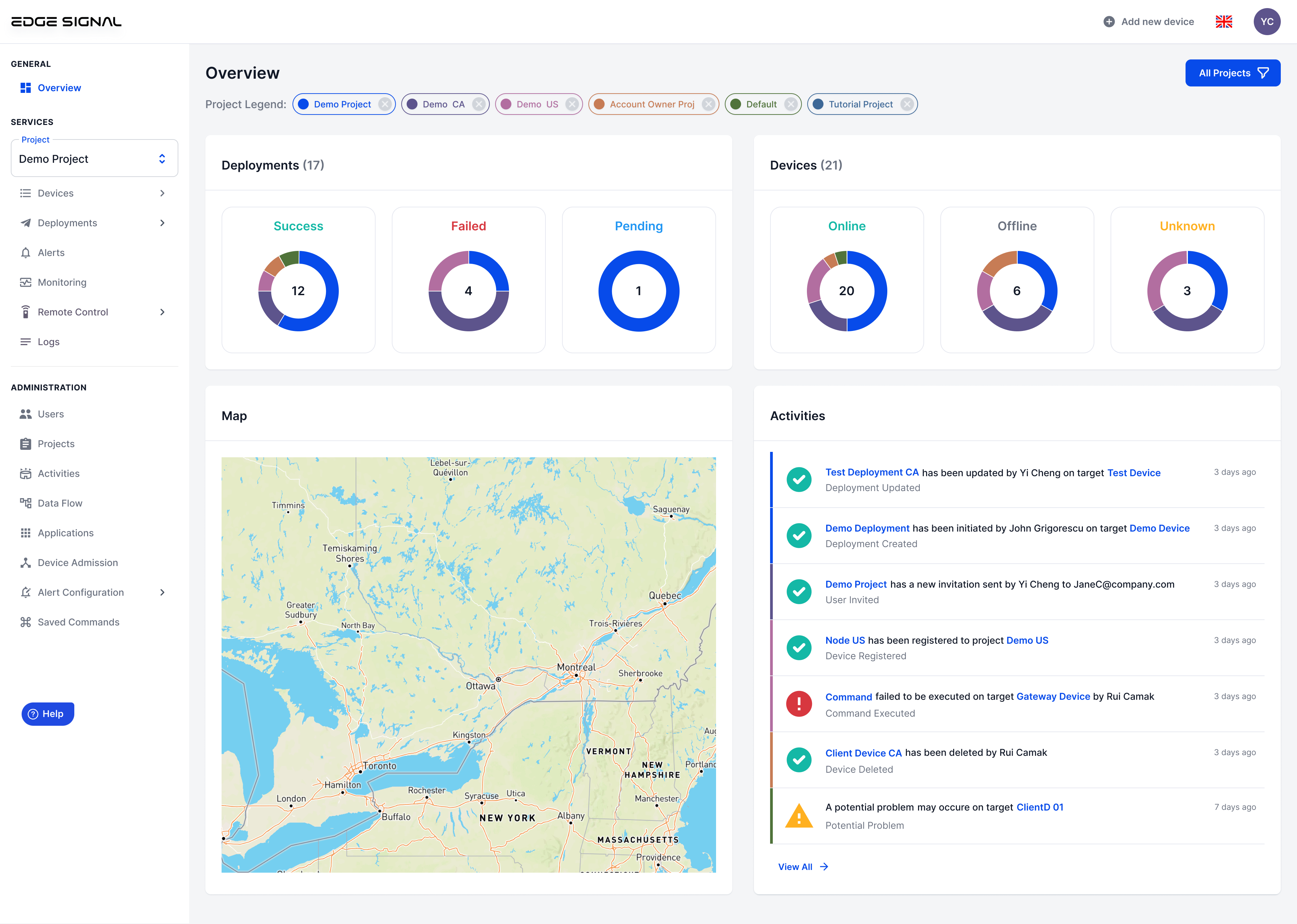
Device management feature empowers users to efficiently oversee and control their network of edge devices. Users can easily view, organize, and manage all their devices from the Device List page. The Device Details page offers in-depth insights and control over individual devices.
Approach: 1. Understand context, requirements and user needs. 2. Map out the task flow 3. Explore, communicate, design, and iterate according to feedback
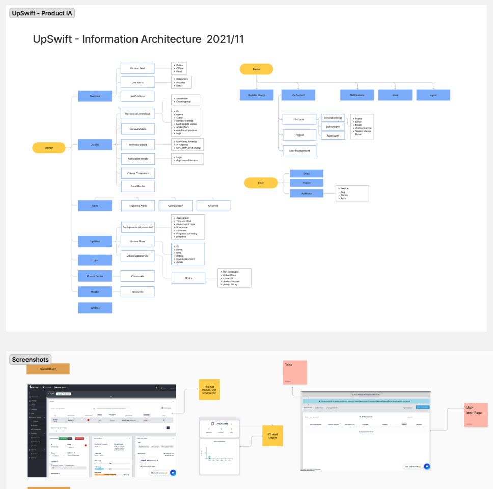
Task Flow:

Design Decisions:
Final Solution:
Approach: 1. Understand context, requirements and user needs. 2. Map out the task flow 3. Explore, communicate, design, and iterate according to feedback
Requirements gathered:

Design Decisions:
Final Solution:
Approach: 1. Understand context, requirements and user needs. 2. Map out the task flow 3. Explore, communicate, design, and iterate according to feedback
Requirements gathered:

Design Decisions:
Final Solution:
Outcome: Device management is the top 1 core feature of the platform.
Challenge 2
An application is a piece of software that can be run on devices. Key user stories: 1. I can view all existing applications 2. I can add new applications to the system 3. I can create new release of an application 4. I can add settings for an application 5. I can view all in-depth info about each application, including its releases and configuration
The design of applications part went pretty smooth as we had build a powerful product UX/UI foundation through device management feature. There were some changes on the tech front and our engineering team was able to make the necessary changes directly on the backend without having me to keep refining the Interfaces.
Here's an overview of shipped applications feature, more details can be seen onproduct docs.

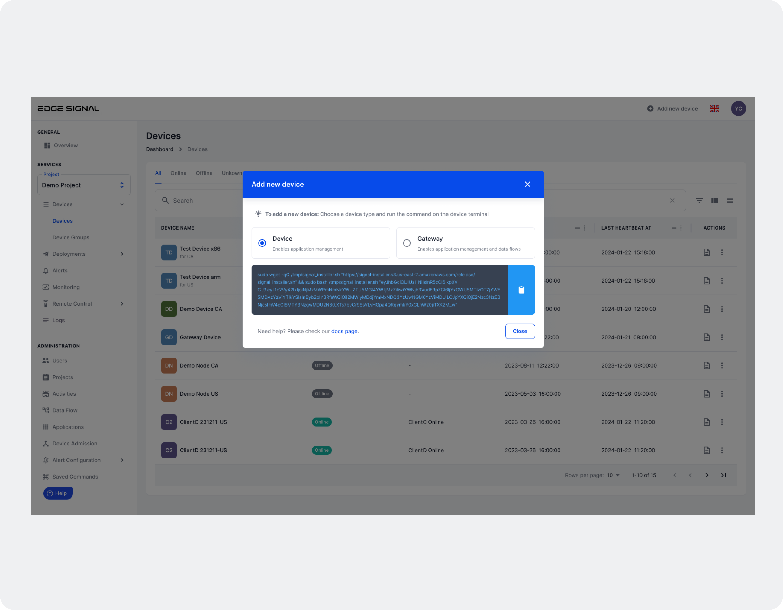
A deployment is a sets of applications deployed to the device. Deployment management feature enables users to efficiently manage the deployment of applications and configurations to their network of edge devices.
Key user stories: 1. I can view all of the deployments and the status 2. I can create new deployment - deploy applications with specific configurations to the desired devices 3. I can view all in-depth info of a deployment and take critical actions
Final Solution: A streamlined, intuitive create deployment experience that enables novice users to configure deployment with ease
Prototype: *There are 2 of 3 deployment use cases included, #1 Device type #2 Gateway type

How I got there | The process of create deployment experience design
I walked through some competitors’ create deployment flow to learn more about the industry practices. Sadly I found out that both of them do not have the exact same capabilities or use cases as our product. However there’re still many helpful takeaways:
While working part-time, the team continued actively developing related features, utilizing the design system. One of our star engineers had crafted a functioning early version. I took the initiative to conduct a thorough review and engaged with the engineer to walk me through the process. Through this observation and communication, I identified aspects of the current experience that work well, as well as areas that could be improved.
With the previous analysis, I had a better understanding of the deisng goal of the create deployment experience:
An intuitive, user-friendly experience that allows users to easily select targets, configure settings and achieve their deployment goals efficiently
Key factors that can contribute to the success of the create deployment experience:
Ideal metrics include:
The existing version of create deployment is a good start, I'd build upon it and make it better with a focus on 3 key factors:
During the design phase, I engaged actively with familiar web tools, sought out UI examples and design patterns/guidelines, and explored our design kit to inform my design decisions. My main research topics included creating new experiences, implementing a stepper, designing selectors for multi-selection, and configuring settings.
Key takeaways:
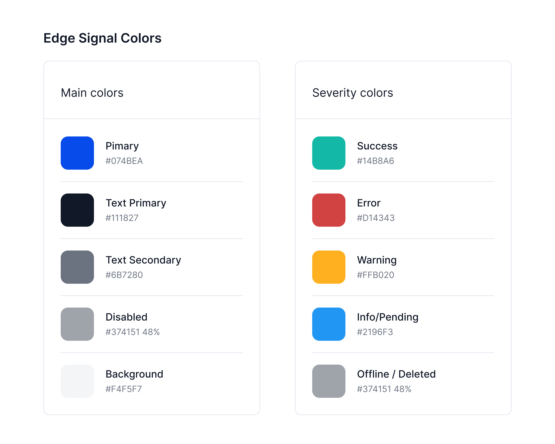
To create a quality product and keep it professional, usable, and easy to maintain in the future while working on a tight deadline and limited resources, I stick to our current design system and aim to create our own design with the minimal effort required from design and development front
Major base components:
StepperCard, Checkbox list, Tablecell list item, Add task modal...
Following the implementation of the entire deployments feature (including the deployment list page, create deployment feature, and deployment details page), we observed significant positive outcomes:


🚧
Portfolio site still under construction
Please stay tune
🧡


.png)


